There’s one thing I didn’t understand in the #creativereview article this morning about the new Seven Great Seas identity. It states that it “rejects sustainable branding clichés”. When looking then at #designweek’s review about it, it says that it resists “surf and hippy-inspired” eco-clichés and 20something co-founder, Will Thacker, goes on to say that the rebrand is an attempt to move away from the previous more traditional “eco-based identity”.
Are sustainable brand solutions now a no-go area, in an age where there are so many young start-ups creating really great brand identities, considered perhaps circular but definitely more sustainable. The world is awash with ocean bound plastic organisations, and I have to say that most of the logos are blue and green such as Ocean Clean-up or Plastic Oceans, so perhaps this is what they mean?
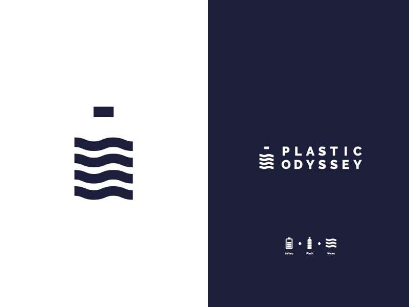
Having worked with Plastic Odyssey on a great educational project last year I learnt about the practices around sea plastic and how plastic waste can be reused and upcycled in different ways to create local economies in places around the world where plastic trash is just dumped in the seas or on dry land by other nations. Also, being a lecturer in circular brand identity, as a relatively new specialism, I wanted to explore this new visual identity in more detail.
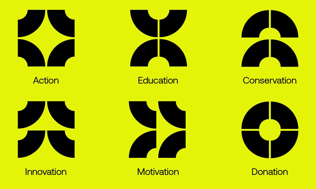
Well, the SGS identity only has 2 colours so we could say that it’s making an effort, but when we work with lots of flat colour – that equals lots of ink.
This is one of the slides from a recent presentation I gave recently on circular branding. Here you can see the difference that ink coverage makes on a logo. Some typefaces are also seen as more eco-friendly in terms of ink coverage, here I cite some which have been discussed in various articles as being the least ink-heavy.

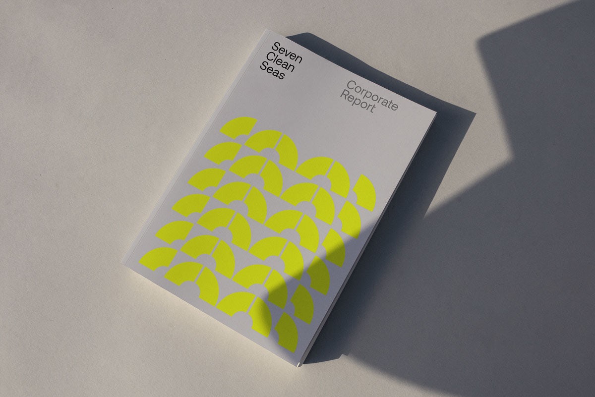
“With their values front and centre of the brief, we wanted to create a brand that referenced their transparency, commitment to hands-on action and the serious impact they make on the world, while being able to flex between corporate reports and presentations to social media and aspirational product lines.”
Quote from the agency 20something
The organisation seems transparent, and the graphic approach of relaying key statistics about its work is really well done on Apps and website. On the other hand does it need aspirational product lines? Well in this case, yes, as it says that it raises money from the sale of prints and t shirts etc for its organisation’s work. But it’s not transparent about where the cost of this re-brand came from? The organisation has only been in existence since 2018.
Does the brand need this big, fat corporate report? I’m not saying that a digital version is the only other solution (because that’s also very energy hungry too), but there’s a lot of paper and ink as well and how long will it be before it needs updating? I really feel that all the brand collateral should be designed congruently with the brand’s core values and objectives.
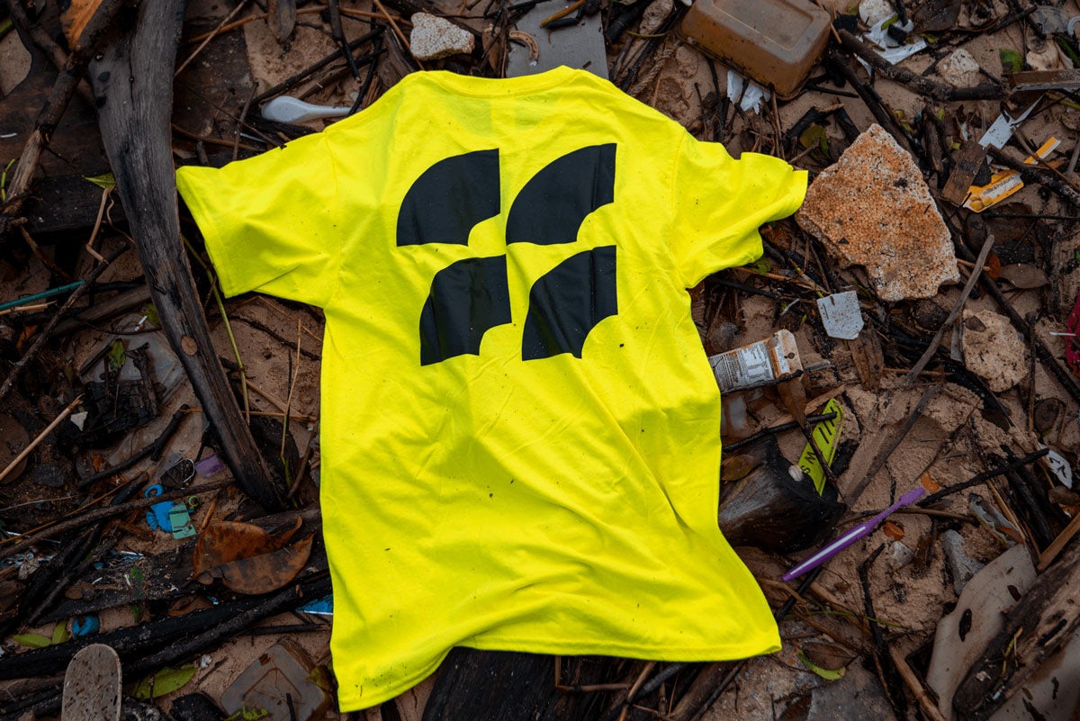
On the other hand, I can see that high visibility can be interesting for an organization working on the beach and in outdoor places – matters of visibility and security are of utmost importance and this yellow T works well. Thacker goes onto say that “the branding intends to be “shouty” in the environmental space. “It’s also got a workmanlike ‘here to do a job’ aspect rather than hiding it away,” I agree, it’s really strong, which is why lifejackets and other high-viz products carry the same codes.
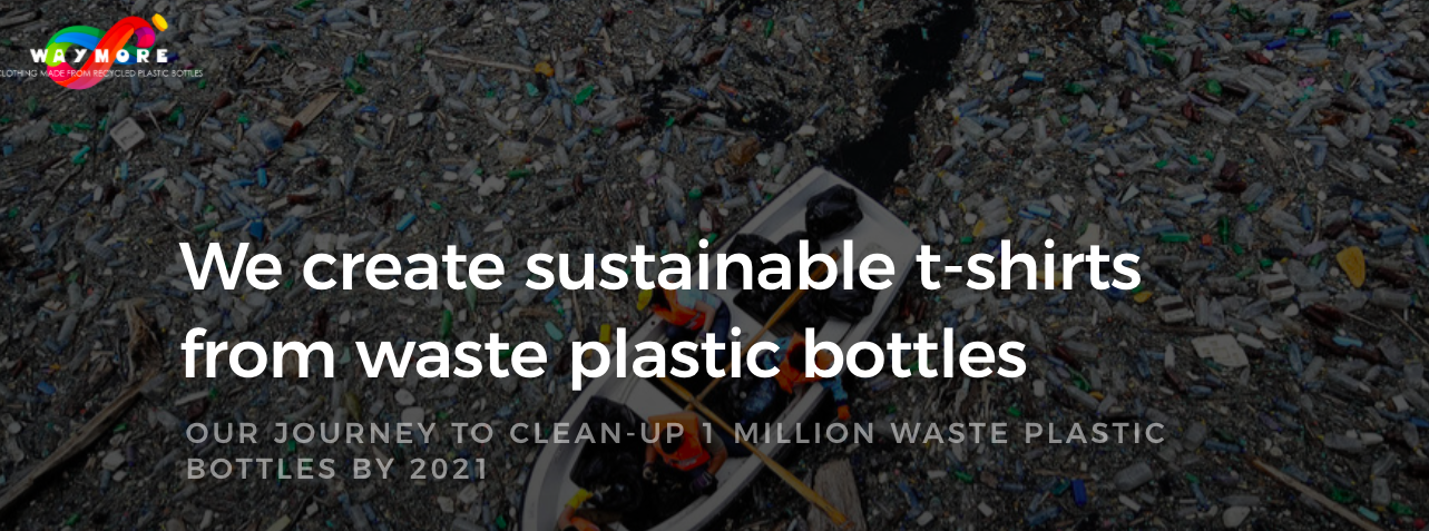
The T shirts that SCS sells in its shop are made of 100% organic okeo-tex and GOTS certified cotton, printed with eco-friendly ink using a plastic-free supply chain. All sounds very good, but why plastic-free, why doesn’t this organisation start a circular system with all the plastic it collects and create its T shirts from plastic like Waymore amongst others? Just a suggestion.

I don’t want to be really negative about this brand identity, I really like the brand system that the agency produced for the different parts of the organisation – it works really well and it’s a very memorable logo. But I feel that if you are working in an area of sustainability you have to be squeaky clean. The identity also really lends itself well to Social Media.

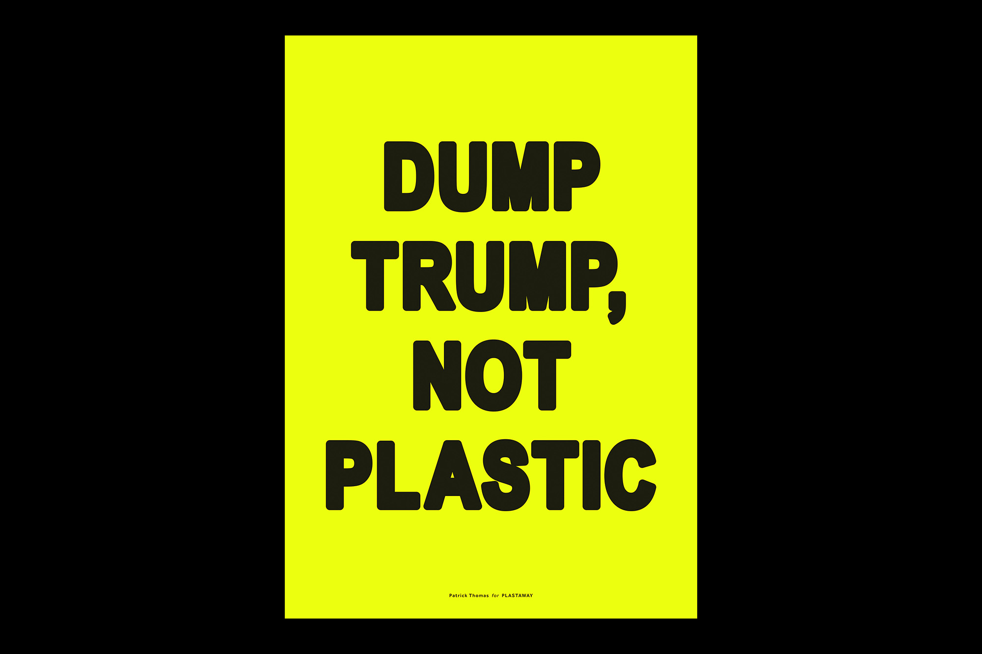
The other thing that bugs me a bit though is that It has echoes of the graphic identity produced by Berlin-based non-profit, Plastaway, which launched Artists Against Plastic Pollution. The brief was to inspire people to reduce their consumption of single-use plastics. And the identity takes a similar yellow and black approach.
Each A3 poster is a limited edition of 30 and is screen-printed in 2 colours onto acid-free white paper. All of the artists worked for free and 100% of sales go directly to charity.
Plastaway is a ‘modern’ NGO run by an alliance of creatives and opinion leaders from the areas of media, politics, sports and entertainment aiming to inspire people from all around the world to avoid single-use plastics.
Plastaway joins forces with international celebrities to create viral educational campaigns and social-media projects. It also brings together NGOs, brands, celebrities and influencers to generate the highest reach possible.

And so, we can say that not all non-profits working in this area are employing sustainable branding clichés” or “surf and hippy-inspired” eco-clichés. They are all just trying to do good job and stand out from the crowd of other plastic saviours. Of which there are many. You can find out more here… plastaway.org/shop/


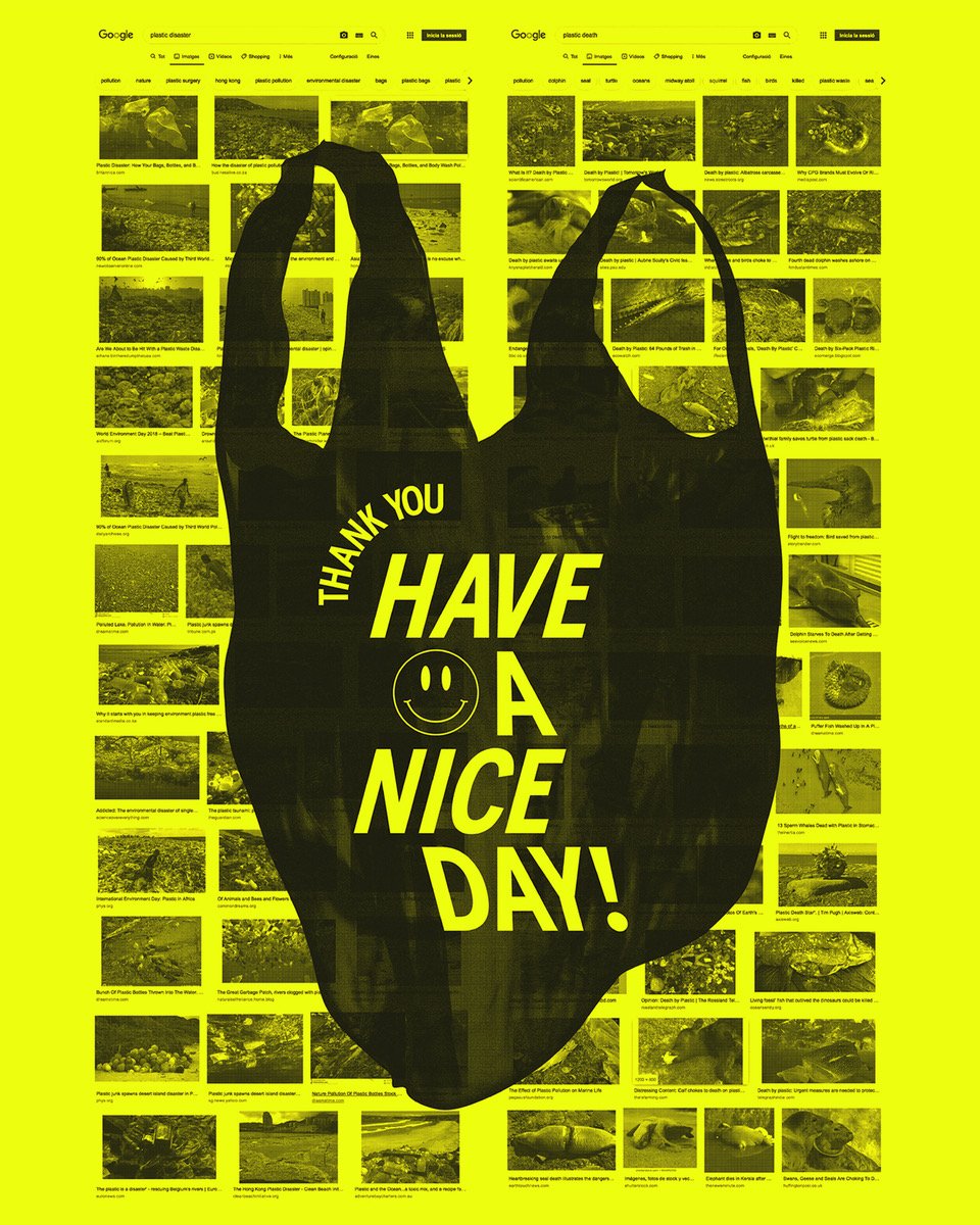
Well, this artist #patrickthomas did get one thing right 🙂
Well, this is a nice one to end on… Have a nice day!