
Which brands stand out for you from your childhood? Which ones bring back the most memories?
For me, Mr Kipling is one of them. When I was a child, we often ate Mr Kipling cakes. I always wondered who Mr. Kipling was? He sounded to me, living in Central London, like he lived in a large rambling house in the middle of the countryside. Somewhere with a large kitchen and a big oven, a dog by his side, tasting raw cake mixtures all day-long.
But of course, I couldn’t have been farther from the truth. According to this article in the Independent…

“The truth is that far from lolling around in quintessentially English gardens dreaming up new recipes for small packaged fruit pies, Mr Kipling has never actually existed. Neither has Uncle Ben, Betty Crocker, or most of the familiar faces found lurking on tins and packets in supermarkets.”
We all had our favourite Mr Kiplings in my house. My dad loved Cherry Bakewells and Viennese Whirls. My mum and I loved the Fondant fancies and my brother, the swiss rolls. On Sunday at ‘tea time’ the Kiplings came out in force. A plate laden with the different types of cakes. Fondant Fancies were small and delicate and you had to lick off the soft cream on top with the icing, before you could eat the rest of the cake – well at least I did.

I always remember the advertising. It was narrated by who I thought was probably Mr Kipling’s assistant baker or perhaps a butler, who explained the special ingredients that go into the cakes – he had a voice that sounded like he was eating a cake said and at the end he said “…but then Mr Kipling does always makes exceedingly good cakes”. I found out today, that the voice was that of James Hayter. “Mr Tebbs” from ‘Are you Being Served?’ A popular comedy series at that time.
I didn’t realise that this is what we today call brand storytelling. And in the course of doing the research for this post, I have seen many comments of lovers of Mr Kipling’s Cakes who cannot believe that Mr Kipling never existed.
Here’s an ad from this time for my Dad’s favourite, Cherry Bakewells.
The brand’s identity and logo has changed quite a lot over the years. When I was a child, we had the first Black and White logo, this was introduced circa 1967. I used to like the ‘cakes’ typography, it looked like the mould for cake decorations of the time. It was also enclosed by the box with a handle.
![]()
Since then, it’s got a little more sophisticated in terms of typeface and flourishes and has turned from black to red, but not a cheap red in the end, a premium red. I think it’s a pity that it lost its strapline “exceedingly good cakes” along the way but as you will see, in 2017 it came back.
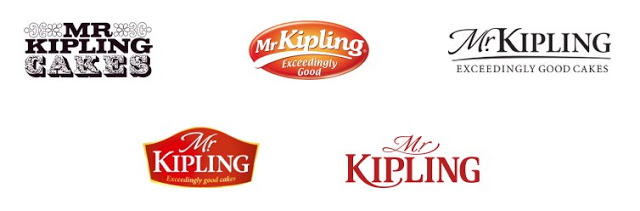
Around 2005, Mr Kipling the larger family cake packaging was really well done in terms of temptation, photographic style and the logotype which ran along the side of the pack giving great visibility on-shelf whilst the open window tip allowed you to see the top of the cake.
However, this new, more premium image designed by Turner Duckworth alienated existing customers as the packs looked more premium but the cake recipes had not changed. A year later, the packaging was re-designed after a steep slump in sales.

Last year, I was surprised to see another redesign of the packaging by Robot Design, with a much more modern look. Part of a new strategy to move the brand into the US and Australian markets.
““It was clear there was a great opportunity in both the US and Australia for Mr Kipling to provide a sophisticated, high-quality packaged cake, but entering as a challenger brand, Mr Kipling would need a bold new presence to compete.”
Kimberley Tonge, Senior Brand Manager for International of Sweet Treats at Premier Foods
And here it is. The new strategy, to refresh and bring some youthfulness to the brand. But where are the brand’s assets? The famous slogan, the graphic elements including the ‘cake tin’, the original brand personality?
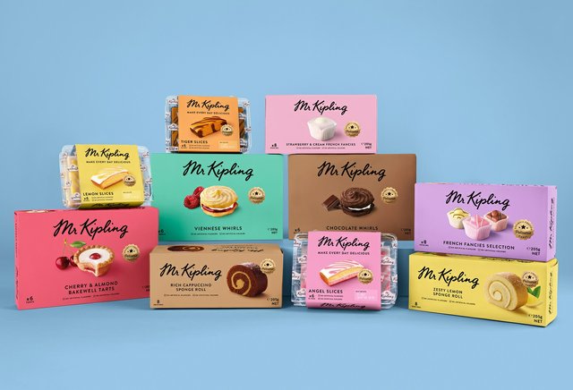
First to launch, were the range of festive seasonal treats with again, a much more premium feel through the use of gold and rich colours.

The Brand Gym, has been doing some interesting work around this brand and their conclusions I feel are spot on. We have to be careful when re-designing to not erode all of the existing brand assets. With Mr Kipling, we could say its identity, storytelling, personality, slogan, packaging design and of course product. If you erode all of these things, your brand can be in danger. The image below is a good example.

Visual icons are very important on pack. We can see from the above pack that we have several key elements. The name and how it is expressed in a logotype – a workmark in this case, the colours, the photography and a more subliminal element, the cake tin shape. This shape semantically is telling us that the cakes are ‘home-made’. As you can see from the evolution of the packaging, this iconic element is no longer.
Colour is primordial on packaging. It can make or break the positioning of the brand and how the product is enhanced and communicated.
In 2015 the lemon slice pack was changed from yellow to pink. This type of change can really confuse the customer, who, on automatic pilot mode in a supermarket would reach out for the yellow pack, knowing that their lemon flavoured cakes were inside.

When Coley Porter Bell re-designed the packaging for the UK market in 2017 it stated…
“We took inspiration from one of our rules of thumb ‘know your visual DNA’, bringing back a modernised version of the cake brand marque to establish a sense of pride, and re-build equity back into the brand.”

We call this Brand Guardianship. Protecting the assets of the brand to build brand equity. Here we can see that the ‘cake tin’ is back, the name and slogan has the look and feel of the previous heritage packs and the photography has a more vintage style.
Yes, the international packs are modern in style, but have they lost the brand equity built over time since the 1960s? Only time will tell.
Any brand moving into a new geographical region must spend time explaining the history of the brand, the storytelling and its assets. Barbie went to great lengths to explain to Chinese parents and their children the heritage and merits of its brand. This is also Brand Guardianship from the brand owner. Branding isn’t a quick fix, it takes time.
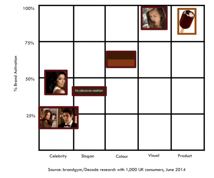
The Brand Gym has devised its own ‘Iconic Asset Tracking’ study (IcAT ) to measure brand assets, and highlight the ones that are most important. Below, is a study they ran on the Magnum brand which indicated how iconic the product shape was to the customer, but how the slogan ‘For pleasure seekers’ and expensive celebrity endorses were relatively weak.
 So, the moral of this story is don’t forget what made your brand famous. How many other children like me believed that Mr Kipling was real, and still do? How many adults will buy their children the same brand to capture the same memories of their childhood? How many customers have gotten a little lost along the way, with all the changes of brand strategy.
Whenever I go back to the UK, I have to buy a box of Fondant fancies for old times sake because, Mr Kipling does made exceedingly good cakes 🙂

Hello im yousef amro from jordan i want ask you if you have an agent in jordan . Please contact me at my email yamr59120@gmail.com or whatsup 00962790558252