
Less is more? I’m not sure.
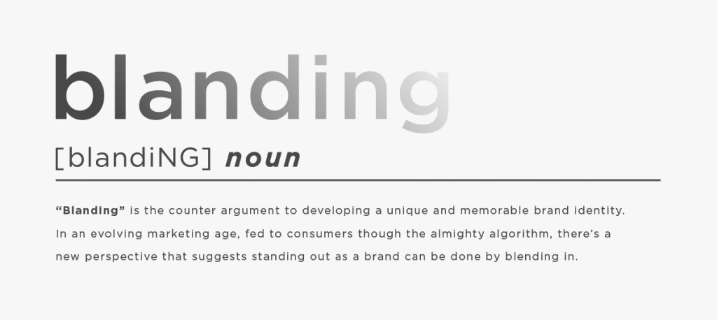
In recent years, we have seen the rise of ‘blanding’, particularly in the domain of luxury brands. We can also call it the democratization of luxury, following on from the idea of ‘New Luxury’ – a luxury strategy to appeal to younger generations’ values, desires and lifestyles, (including the development of lower priced products of a lower quality.)
Jean-Noël Kapferer, the co-author of The Luxury Strategy explains this idea.
“The democratization of Luxury markets is in full swing… “Everyone has the right to luxury.
I’m sure you have seen the movie Titanic… At that time, luxury was segregation. You had people at the bottom of pyramid – or the boat – and people at the top, and they didn’t mix. They were not allowed to move from one tier to another.
“Today that is finished. There are still people at the top and still people at the bottom, but they want, for maybe five minutes, ten minutes or half an hour, to go to the top of the boat and to enjoy luxury.
And enjoy luxury they are. This new mass interest in luxury has allowed the industry to achieve record-shattering results throughout periods of economic malaise and political turmoil.”
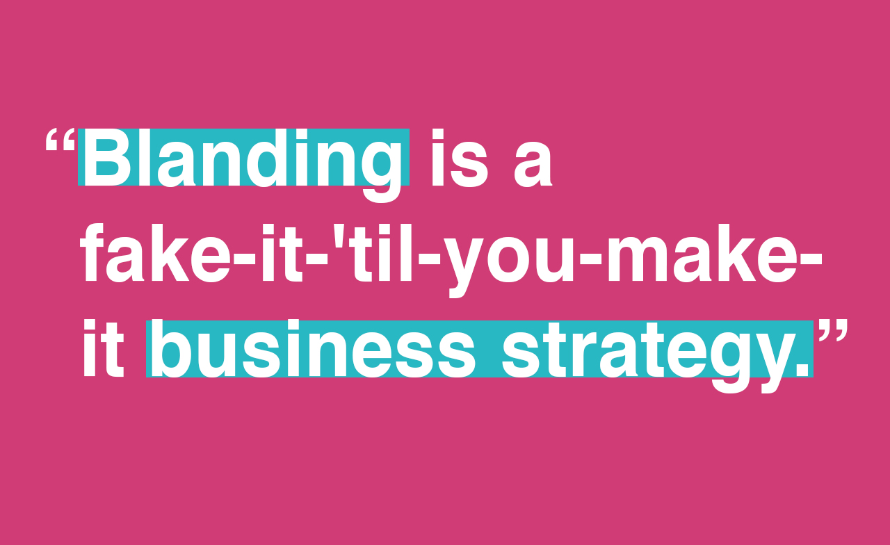
And so, what is blanding?
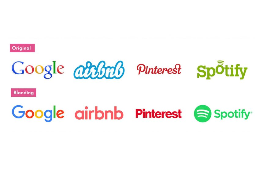
Blanding includes…
- Sans serif fonts
- Clean lines
- Limited color palette
- Overall simplification
- Blanding is a visual brand identity that’s:
- Controlled
- Ahistorical
- Flat
Some examples:
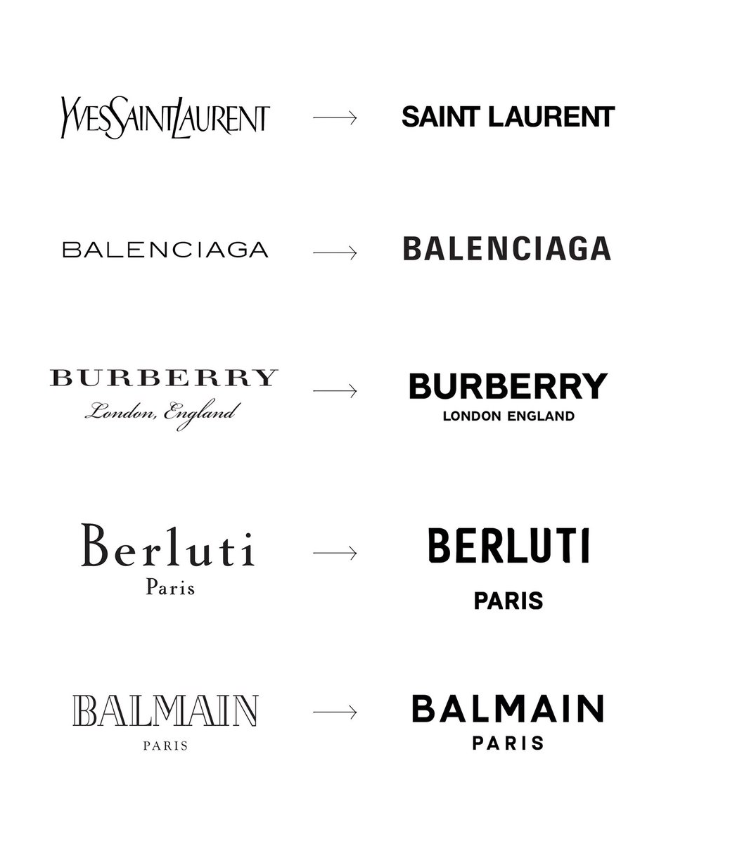
What happened to the prized and protected history, heritage and and identity of the French “Maison”?
The problem is that the ‘blands’ haven’t earned the branding they ape – they do not have the heritage or the brand equity of luxury brands. They do not have the historic tales to tell of their entrepreneurial founder. They do not have a unique, artistic savoir faire.
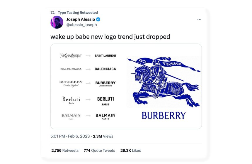
So, what happened to those luxury logos which were distinctive? Which conveyed the history of the brand, it’s savoir faire, it’s differentiation, its values? Some of them have been reinvented and have made a comeback. After all, if everyone looks the same, where is that unique luxury positioning?…
One brand which has ditched its ‘blanding strategy’, is Burberry.
Burberry’s relatively new creative director, Daniel Lee, was tasked with moving the brand ahead and did so by using many classic motifs: English roses, hunting-lodge hats, and, of course, Burberry plaid on everything.
“It wasn’t so very long ago that the word “branding” was frowned upon. But: “I love smart branding,” he says. In 2018 Burberry’s then powers that be got rid of any horsiness; they also renamed Burberry – traditionally, simply a company, then outfitter – a “house”.
Daniel Lee.
Lee wanted to re-focus on heritage. He launched a campaign around Britishness, including how you take your tea. The look of that campaign was familiar to longtime fans of the brand. At the same time, out was the blocky sans serif logo created in 2018 during Riccardo Tisci’s tenure, and in was a more classic serif font along with a new version of the Equestrian Knight Device (EKD) that was first used by the house in 1901.
The return to a serif font piqued the fashion industry’s interest as a move away from what creative directors Thierry Brunfaut and Tom Greenwood first coined as “blanding.”
Burberry’s first logo, designed in 1901, featured an equestrian knight on a horse, carrying a shield with the Latin word “Prorsum” which means “forward” in English. The knight and the shield were positioned above the brand name, which was written in a serif font.
This logo represented the brand’s heritage and its association with the British aristocracy. The equestrian theme was particularly relevant as Burberry had started as a company that produced outdoor clothing for hunters and other sports enthusiasts.
As you can see, the logo stood for some key values and its unique know-how.
Does a blanding strategy do the same job? No. It doesn’t go anywhere near this.
And so, where did blanding all begin?
“The main offenders are tech companies, where a new army of clones wears a uniform of brand camouflage. The formula is a brand paint-by-numbers. Start with a made-up-word name. Put it in a sans-serif typeface. Make it clean and readable, with just the right amount of white space. Use a direct tone of voice. Nope, no need for a logo. Maybe throw in some cheerful illustrations. Just don’t forget the vibrant colors. Bonus points for purple and turquoise. Blah blah blah.”
Thierry Brunfaut and Tom Greenwood
Tech giants like Apple, Google, Airbnb, and Uber communicate in basic codes that work almost like signage. They have intuitive branding; with simple visual cues, they can convey youth, friendliness, progress, newness, nowness, and, above all, tech…
Where has our confidence gone as marketers, where has the carefully curated brand management gone? Is it the increased pressure to focus on short-term success, such as quarterly numbers – this never was the case with luxury before, but now brands are seeing profits drop quite considerably in certain nice markets such as China.
Maybe it’s that we seek validation in that executive team meeting where we can point to competitor actions to justify our decisions – and there are many of them using blanding.
No matter the reason, it reflects our continuing diminished connection to the customer — understanding what excites them, delights them, and grabs their attention to make them come back to us for more.
Can we adapt more quickly to the markets and our digital campaigns and pop-up shops with a sans serif typeface in black?
Perhaps. But it’s very bland!
Here’s a response to a recent re-branding of PayPal from a writer and media consultant…
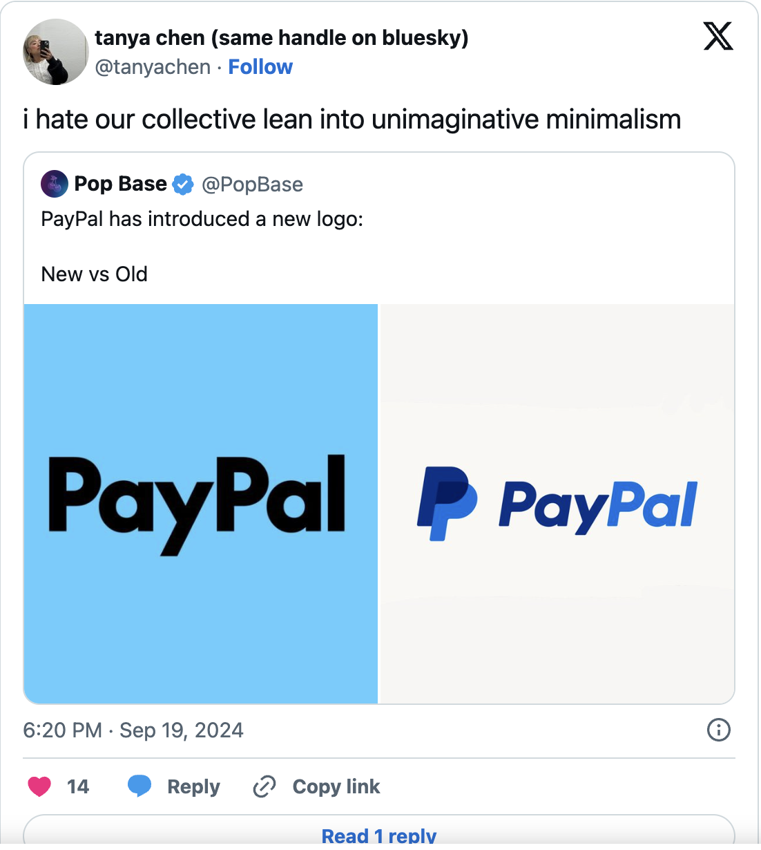
“One driving factor in the minimalist movement over the last two decades has been an increasing focus on digital and design that looks good in a UX setting, especially on phones. “It’s all functionally driven, which is such a boring reason, but it’s all done in service of activating your brand across more platforms and reaching more people,”
And so where do we go from here?
Well like all trends that come and go, I think Luxury brands will wake up to the fact that they all look the same. Bland. And designers have a responsibility here of course to educate their clients about the craft of lettering, typography, serif and sans serif fonts.
Many original logotypes were created in moments where craft was important and was a backlash to modernisation and industrialisation – the Arts and Crafts Movement and Art Nouveau were two such epochs where typography was of utmost importance.
when visual elements were painstakingly made by hand. That inherent imperfection doesn’t necessarily work in today’s highly technological society with its reliance on digital platforms.
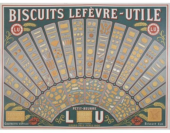
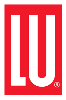
Then the Lefevre-Utile Biscuit factory changed it’s strategy to become “LU” and were the first company in France to use an American logo designer, no other than Raymond Loewy to create it’s new brand identity.
As we can see here, trends come and go. The past is reinvented and reimagined.
I am sure that luxury blanding will become branding again we just need to find the heart and soul of our brands again.
